I work once a week at the Monastery Horse Stable cleaning stalls, feeding horses, and filling hay nets. The barn recently acquired a new horse, named Skip. I like to call him Skippie. He is spunky, gentle and friendly.
Here is a photo of Skippie to the right —>
As the end of the semester and end of the year approached, I wanted to create a quick holiday greeting card.
In the past, I have made very intricate ones as promotional material, but this time I challenged myself to create something “quick” to print with the risograph printer at Moore College of Art and Design, (where I teach Illustration and Graphic Design).

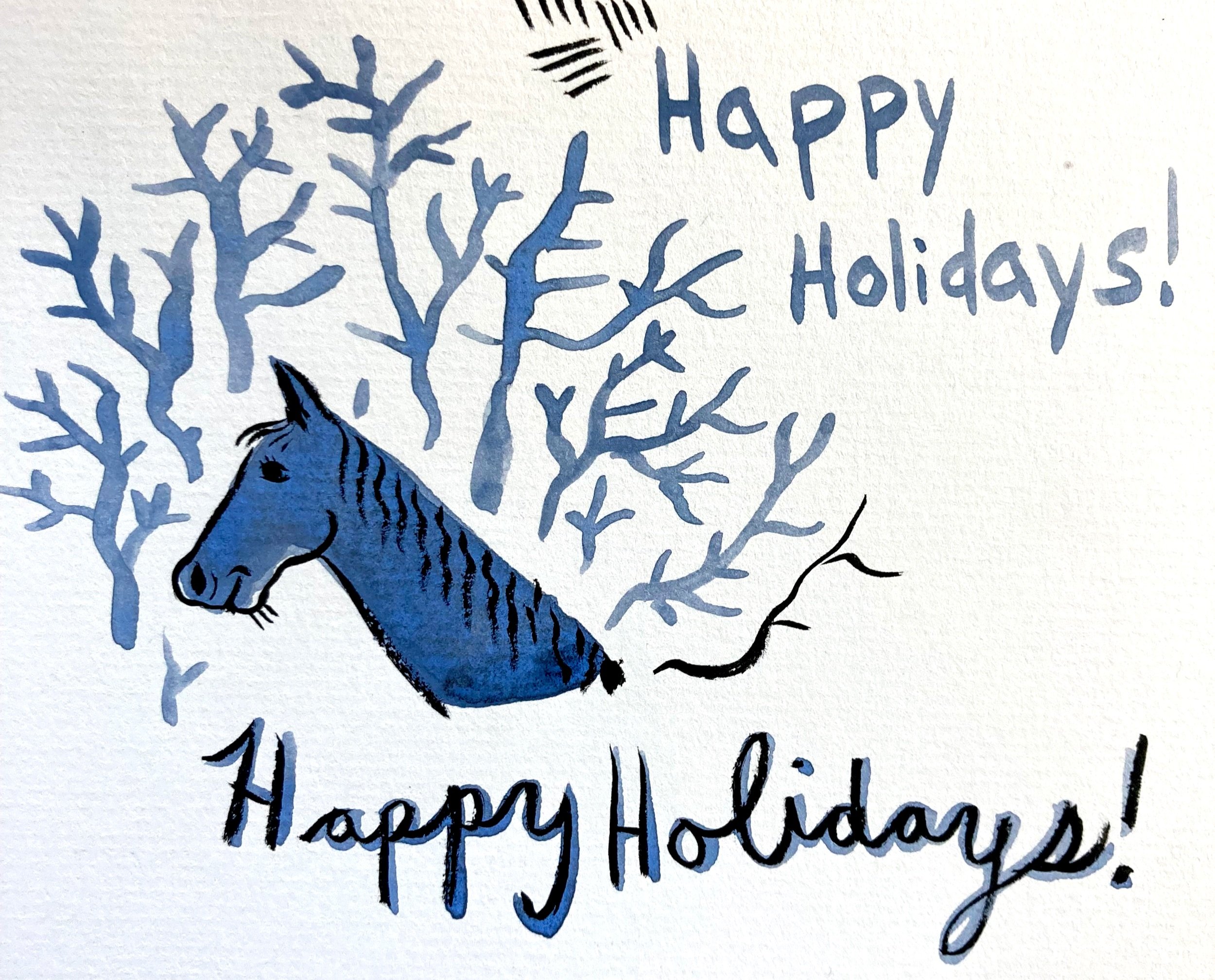
With only 3 days until the college closed for the rest of the year, I began sketching Skippie the horse, inspired by his wavy mane and the naked woods behind him. I couldn’t get his profile out of my head. I needed to keep it simple because of the short turn around time.
Starting with a realistic study, I drew and painted his head over and over, until I simplified it down to naive shapes.

Holbein gouache and ink on paper
Gouache and Ink on paper
“Happy Holidays” didn’t seem like it had much to do with an image of a horse head, so I changed the text to “Joy to the World!”.
Skippie is joyful!
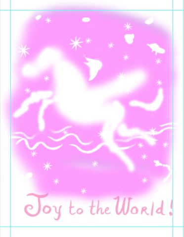
The next day, after a full day of student final critiques, I scanned and placed the Joyful gouache study of Skippie’s profile into the computer. I separated layers for a 3 color riso print, using pink, blue and black. I added other little doodles of animals in the naked woods and negative spaces for stars.

After about 4 hours photoshopping this together, I looked at it and it made absolutely no sense.
Why is there a random horse head is sticking out of forest?
Is it even Joyful?
There was no movement in a disembodied horse head.
Why not draw the entire horse?
But I was so obsessed with the silhouette of Skippie’s head.
I was attached to my sketch.
Time to Kill a Darling!
The next morning with only 3 hours until I had to print the final artwork, on the very last day the college was open, I decided to redraw the horse. Maybe I can make it a Joyful Swimming horse, that way I can build upon the art I already have:

< — No, that looks weird.
I frantically texted my trusty old classmate, Professor Beth Post in Utica, and asked her opinion.
I was time to commit to drawing the entire body of the horse!
I put a timer on for an hour to focus on new sketches.


< — A vertical composition worked better with the full body of the horse.
What if it’s a flying Joyful horse?!
Or a penguin on a flying horse, since penguins can’t fly and also, PENGUINS!
I sketch faster on paper, but to finalize the composition, I quickly took the drawings on paper and re-sketched them in Photoshop with a wacom tablet. —>
I inked the final sketch of the new flying Joyful horse, inspired by Marc Chagall and the painting below from Kiki’s Delivery Service:


Each color layer needs to be in grayscale to create the masters for printing on the risograph machine drums.
As you can see on the right, different opacities of the colors create a lighter shade of the color. Multiple colors can also be layered on top of each other to create new colors, for instance, blue + pink = purple OR yellow + pink = orange.
Below is the final artwork, separated into layers for risograph printing using Black, Pink and Blue.
BLUE - below:


PINK :

BLACK :

3 COLORS TOGETHER :


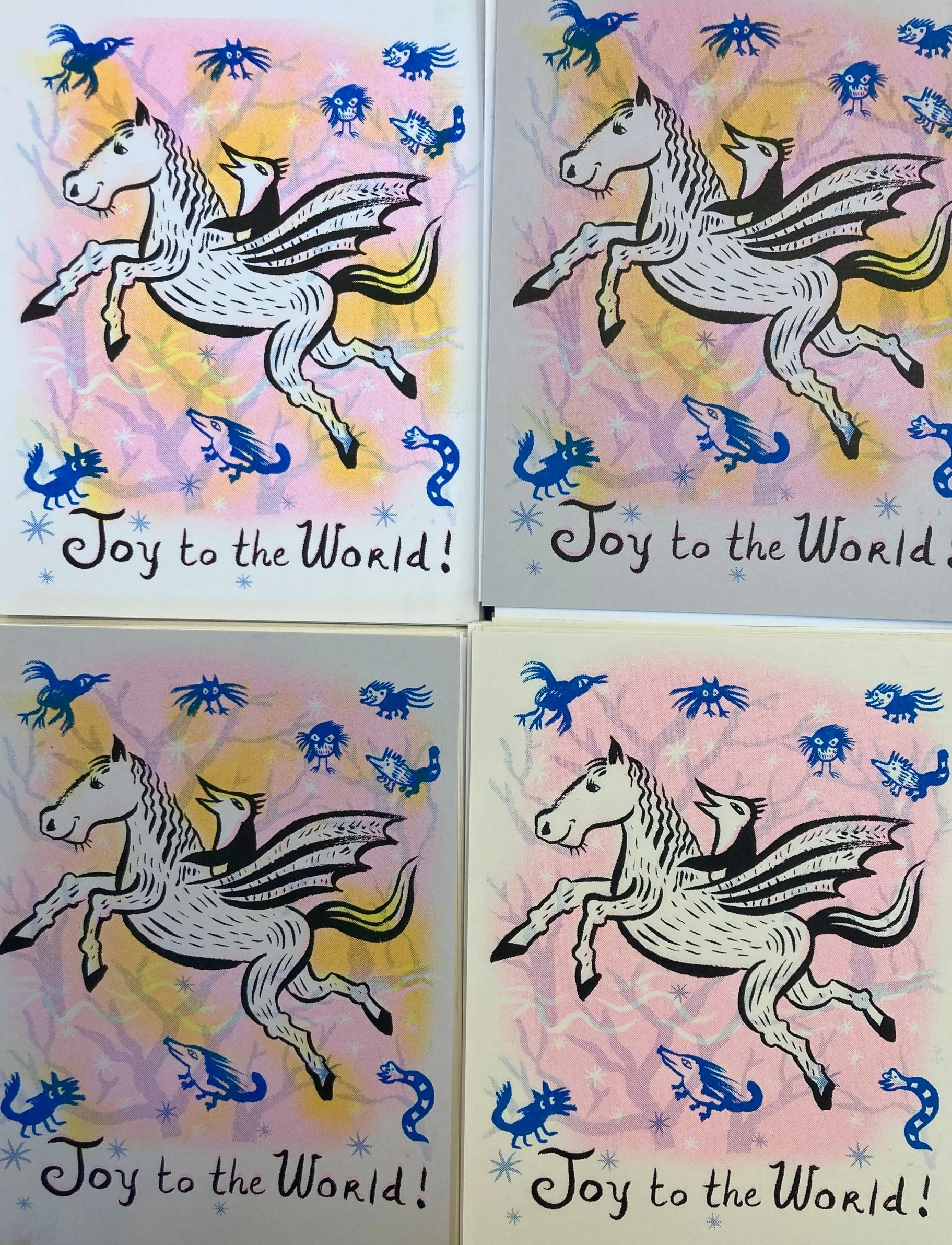
FINAL PRINT !
Another fun thing about printing with a Risograph printer is using different colors of paper.
Below is the final print on bright white, gray, and beige papers.
Rich Harrington stopped by the print room to check out the machine. In a demo for him, I added another color layer, Yellow, and showed him how to make a master and print colors on top of each other. The Yellow layer was not planned but I like how it turned out as a 4 color print. It adds a warm glow and more Joy!
That is the end of my story of the risograph “Joy to the World!” card, created and printed in what felt like 24 hours.
Although this was a “quick and simple” card, I put a lot of process work into it and made a lot of changes. I thought about the combo of the image and text - if the image really communicated the concept of Joy. I let go of my obsession of the horse head and gained a happy accident using another color layer of yellow. It felt like a whirlwind, but Risograph printing is always worth it!
The cards are printed on card stock and are available to purchase on my web store.