Evil Zine Cover - Dog Bowl Zine Club

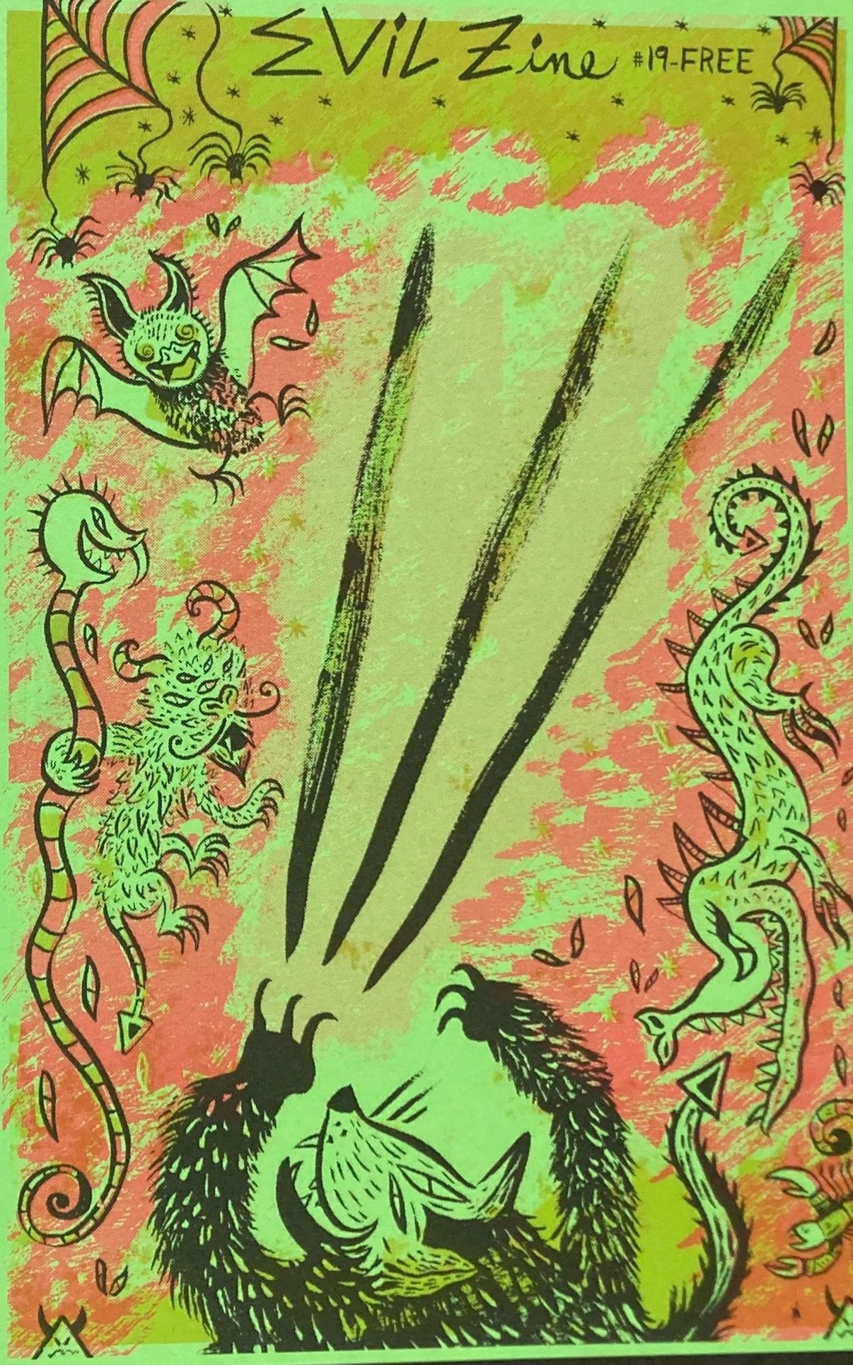
Jesse Arbor invited me to create the cover for the Dog Bowl Zine - “Evil” Edition, with the intention of printing it at Moore College on the risograph printer.

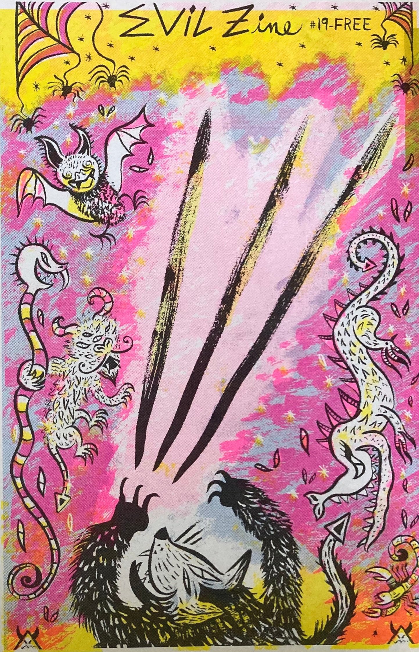
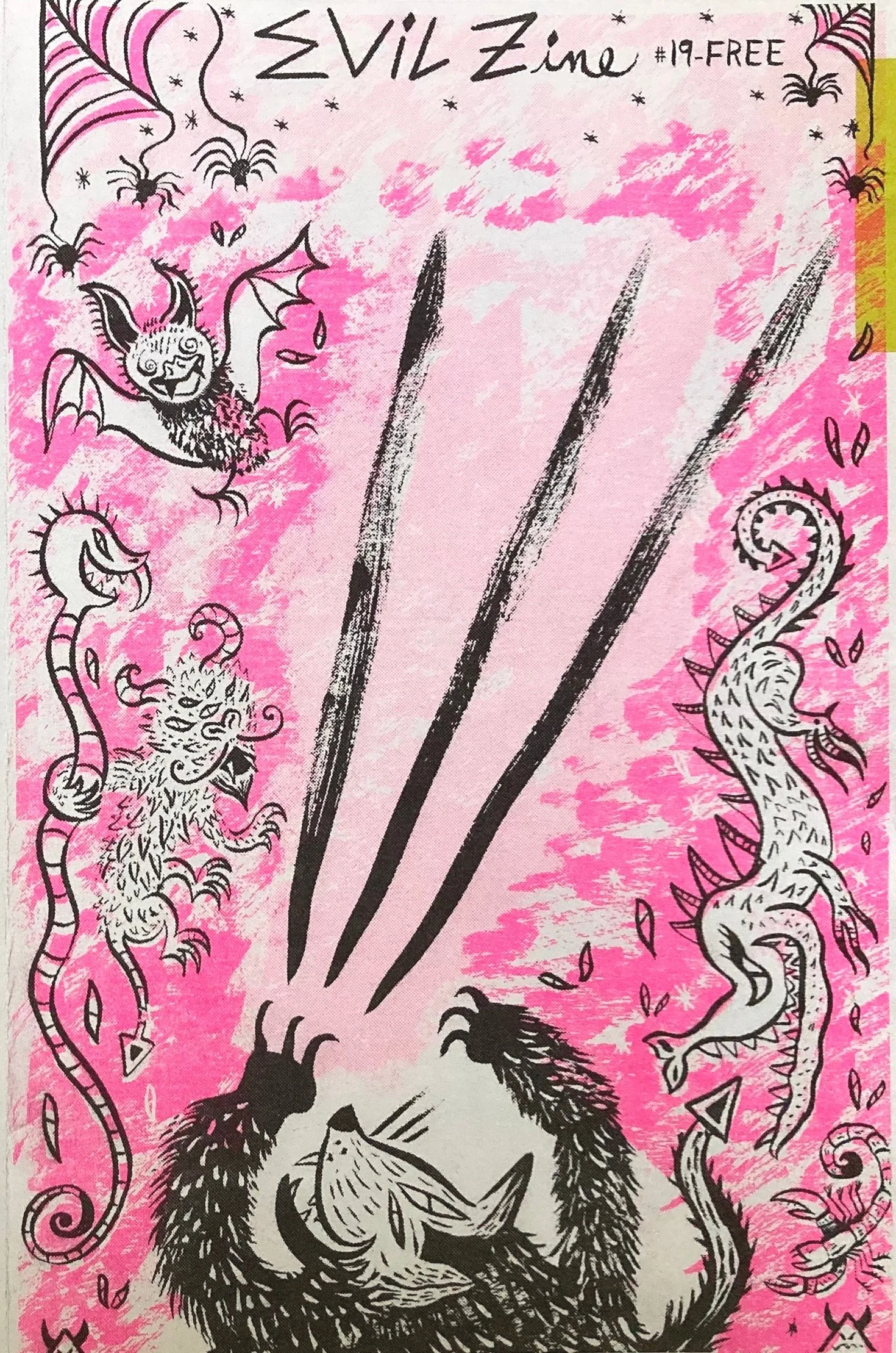
Below is the finished 4 color print in Blue, Pink, Yellow and Black. I also liked this simplified 2 color print with pink and black:

Evil……hmmmmm. I’ll talk about my process creating and printing this illustration.

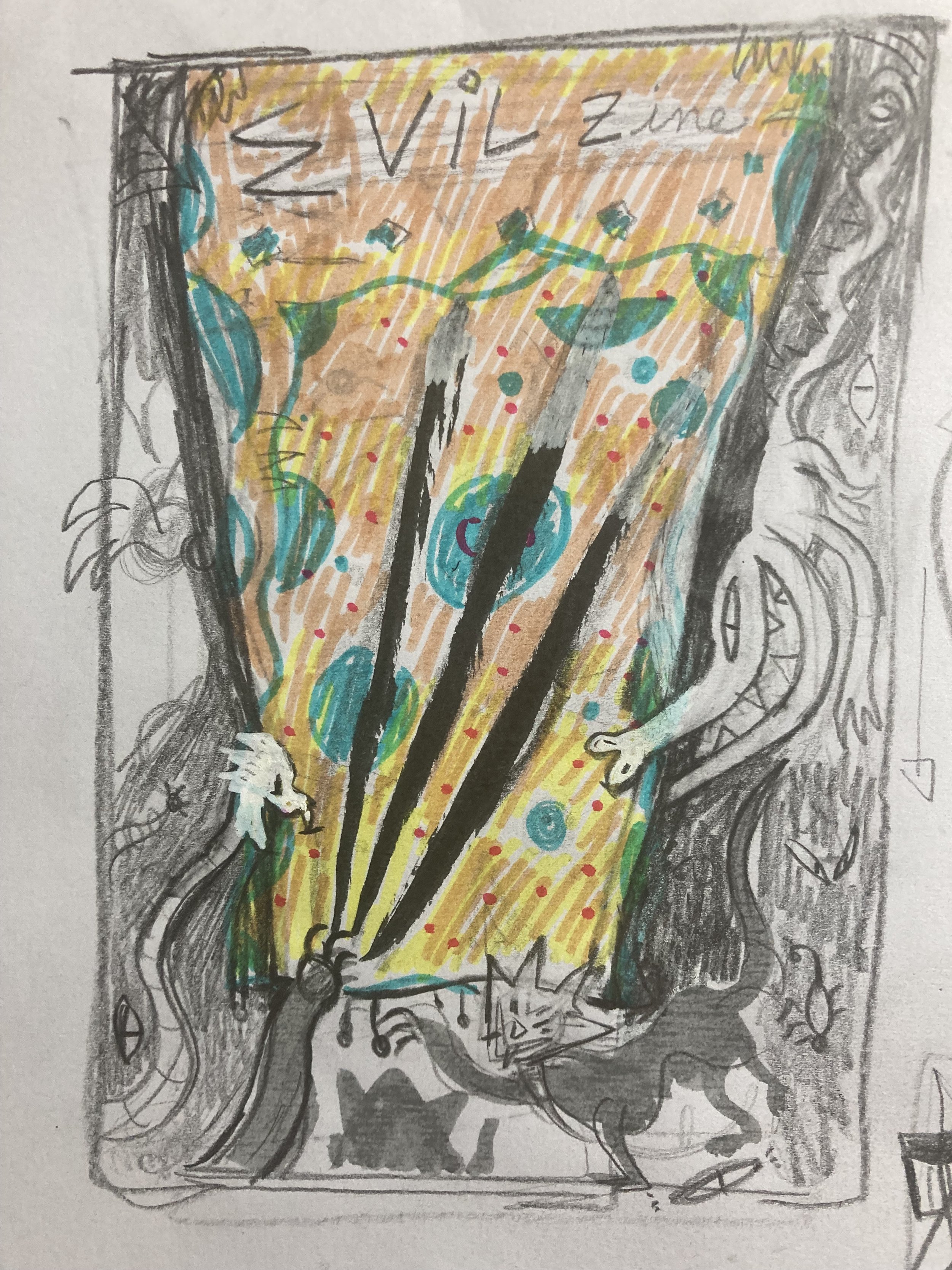
I began with many sketches, (some on napkins):

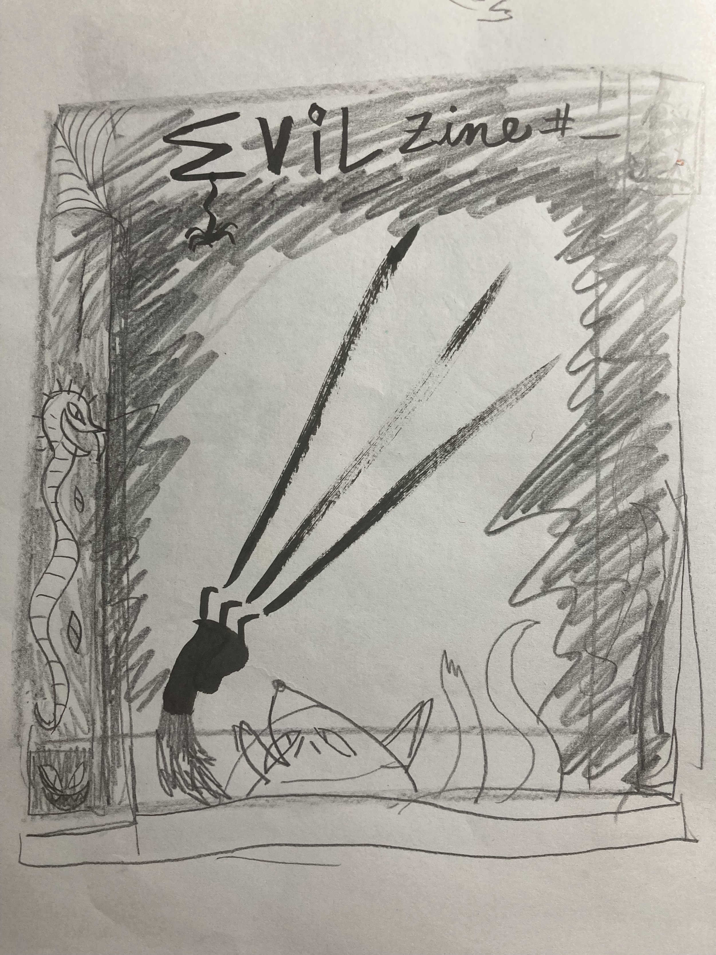
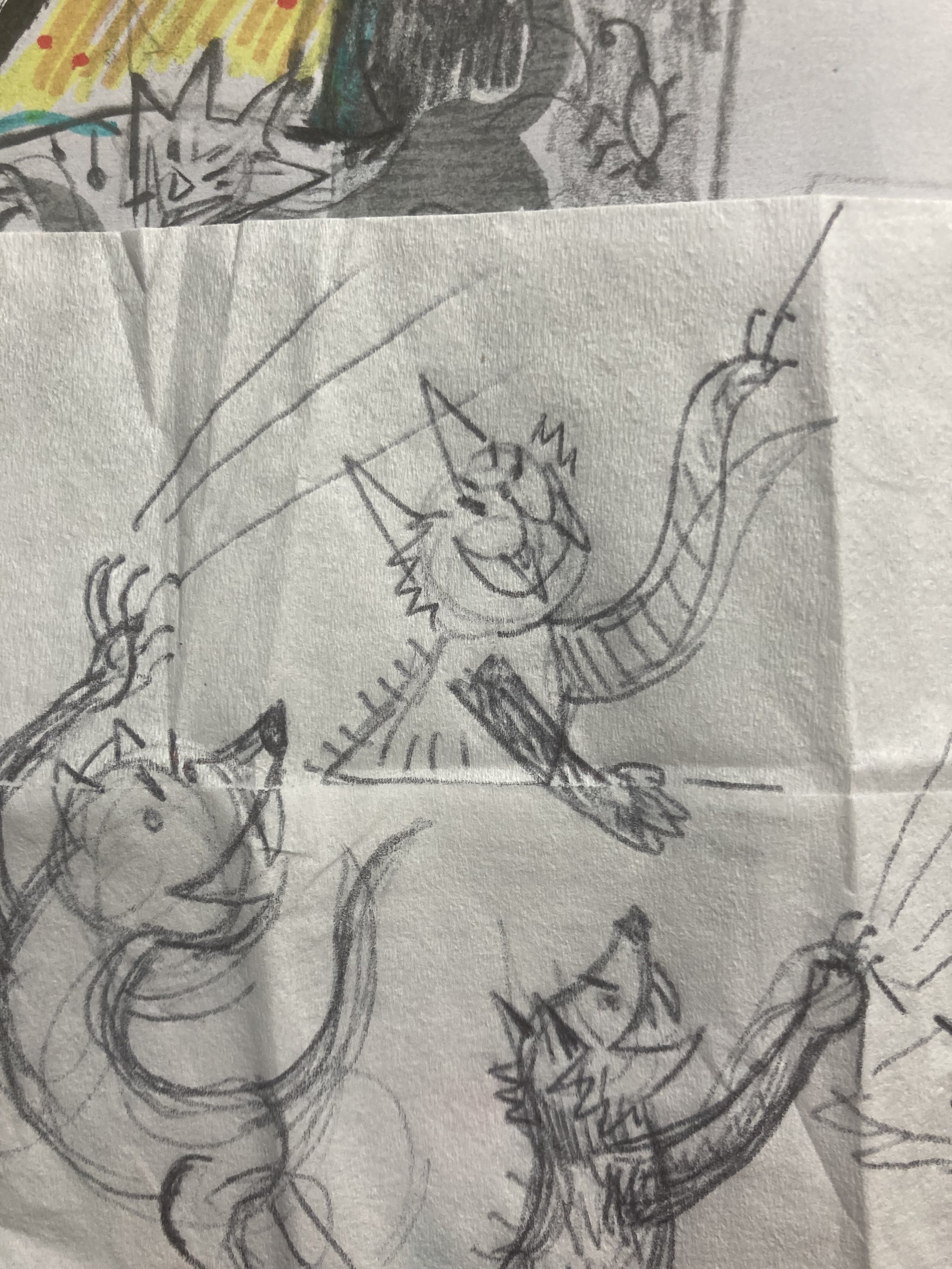
I liked the idea of claw marks of a cat scratch, using my brush pen to make it dramatic.

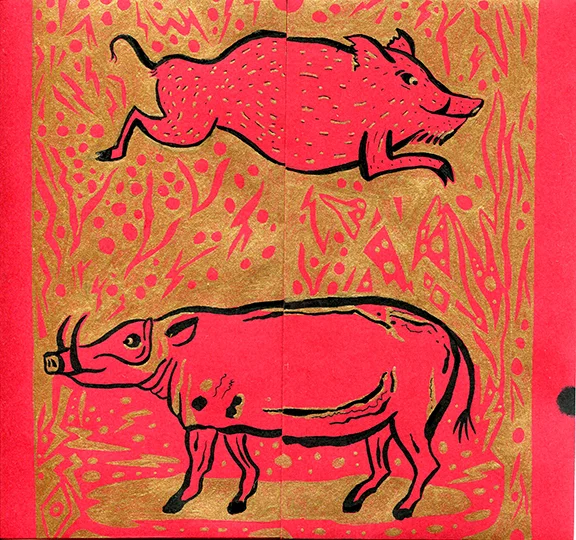
Since the theme of this publication was “Evil” and it is for the Dog Bowl Zine Club - it made sense that cats are evil.

Time to commit to one sketch and ink it.
The line art became the “key plate” - the part of the print that contains the majority of the key's detail and is usually printed in black.

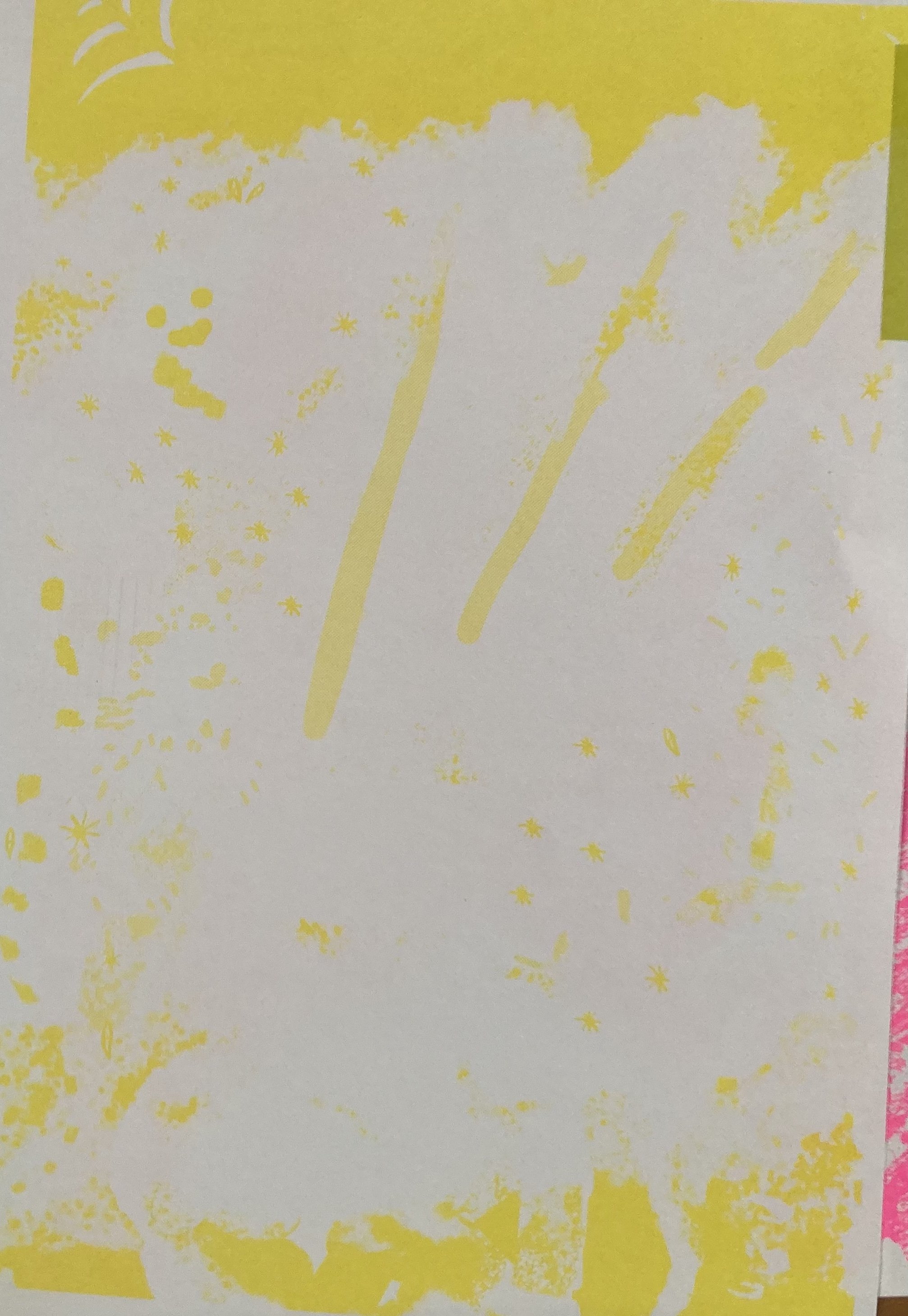
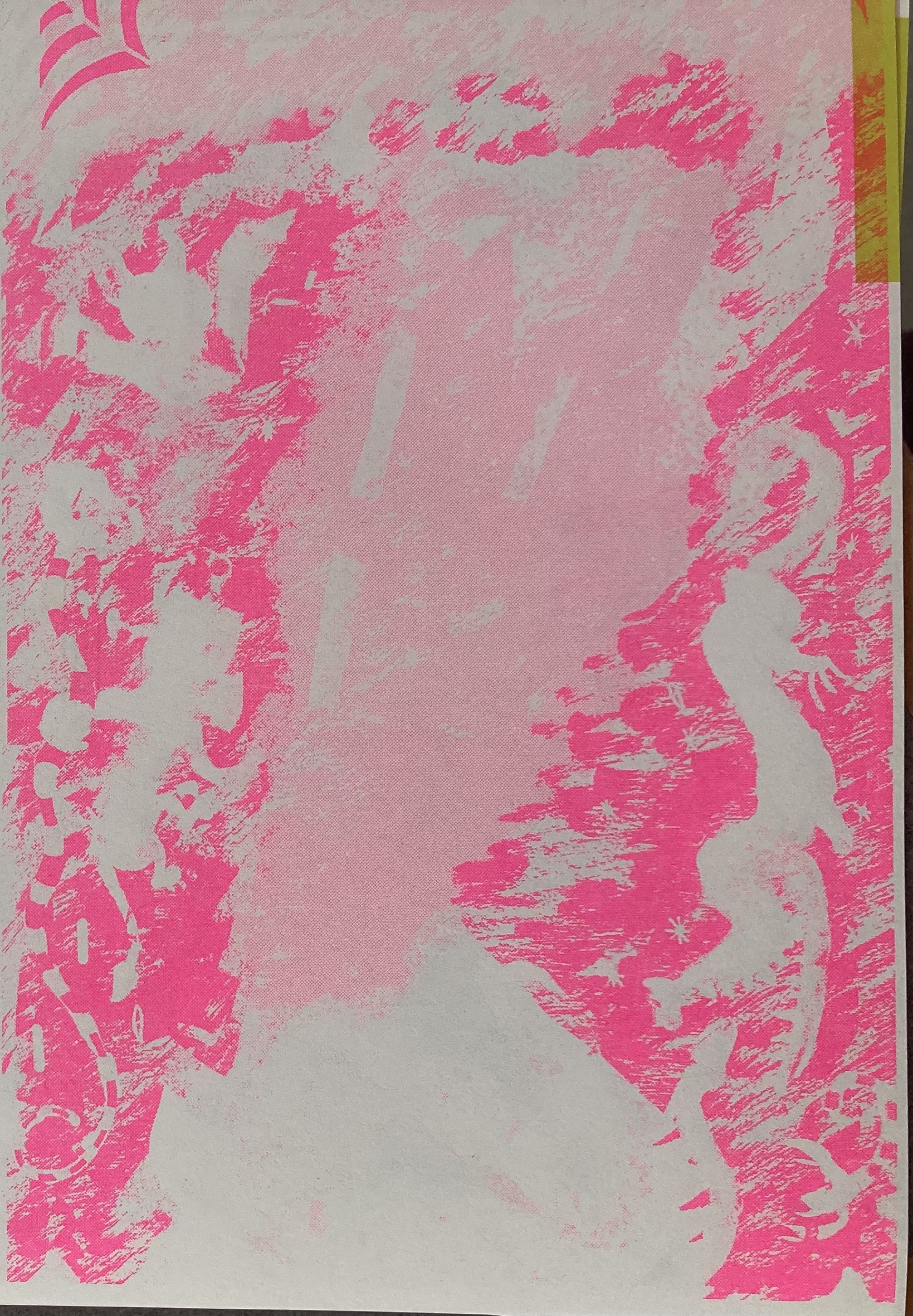
With this specific risograph printer, one must print each color one at a time, on top of itself.

The prints come out quickly, but each color needs to be set up as a separate image file.

Below are examples of the yellow, pink and blue color files - printed individually as well as layered:

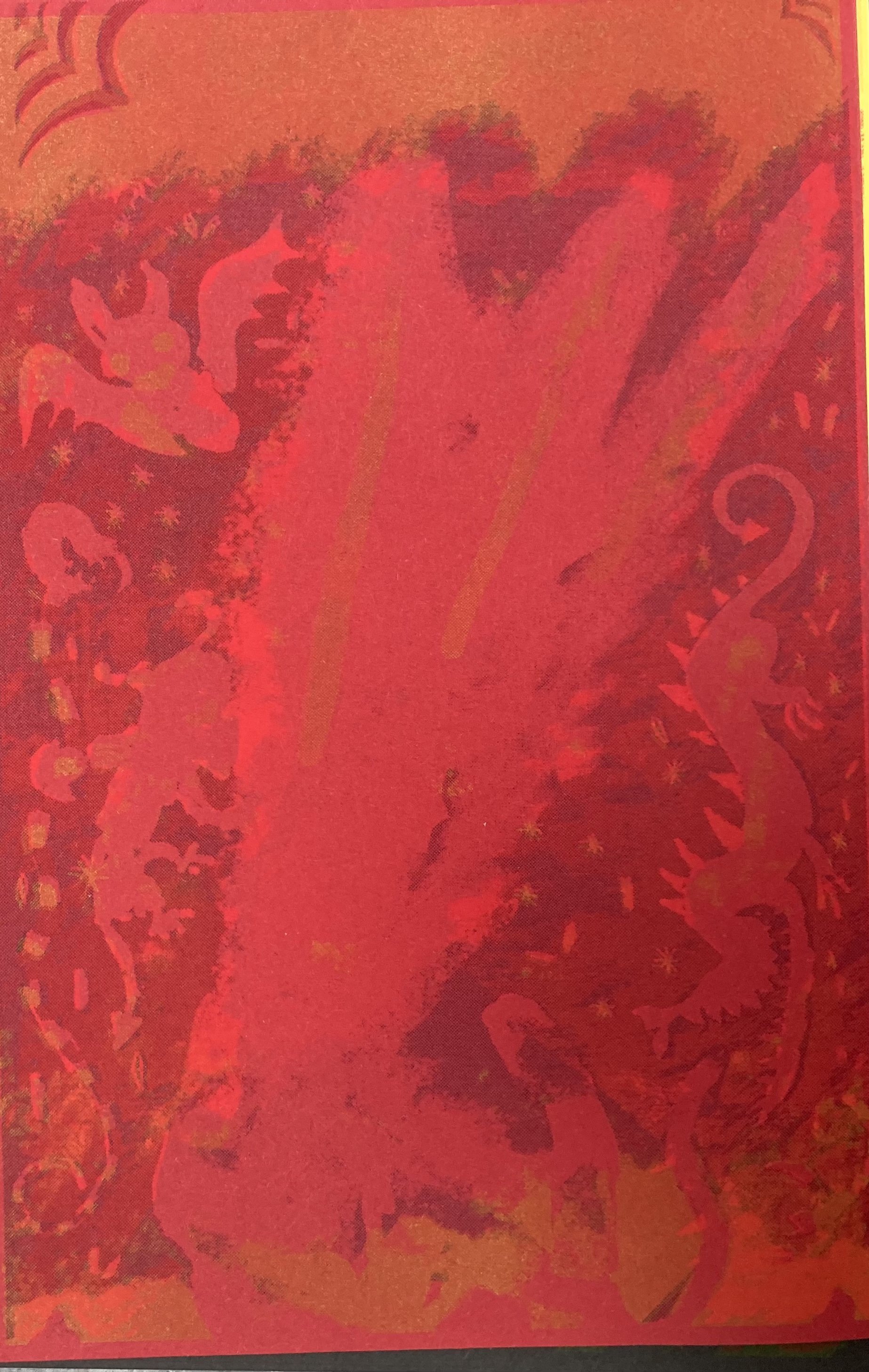
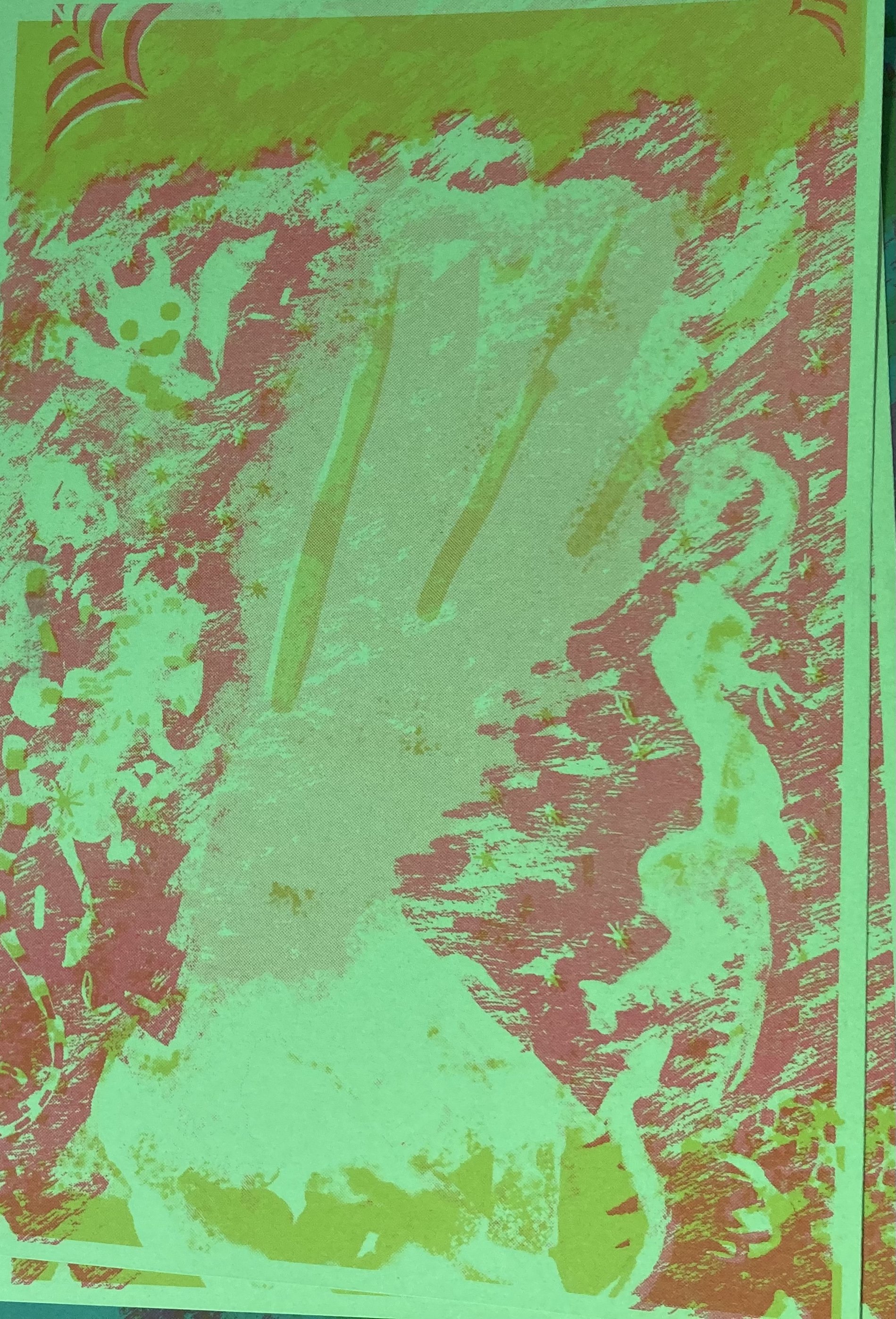
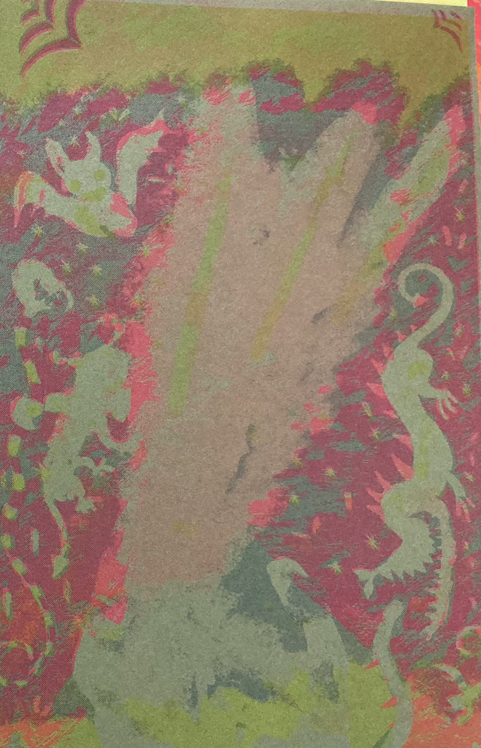
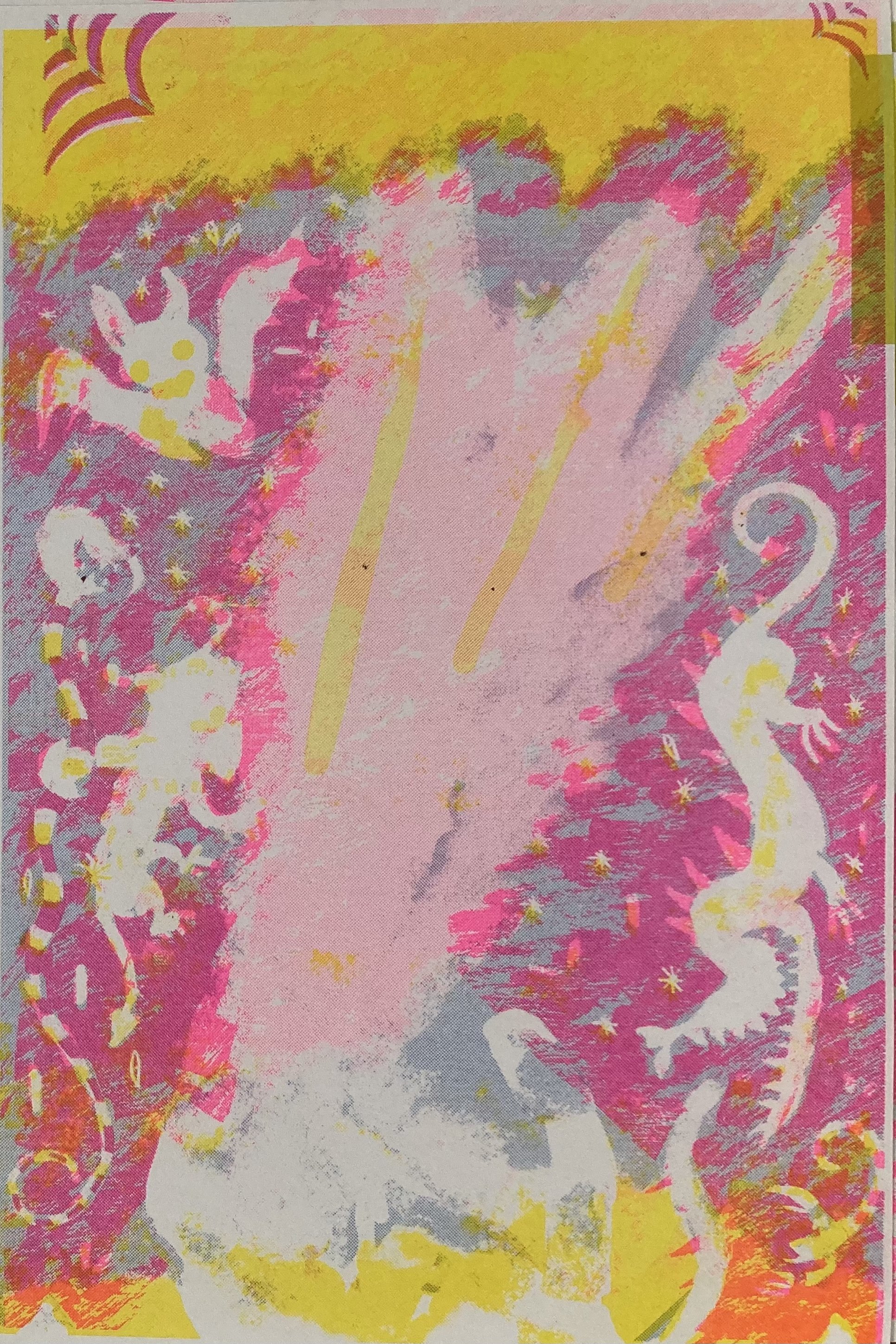
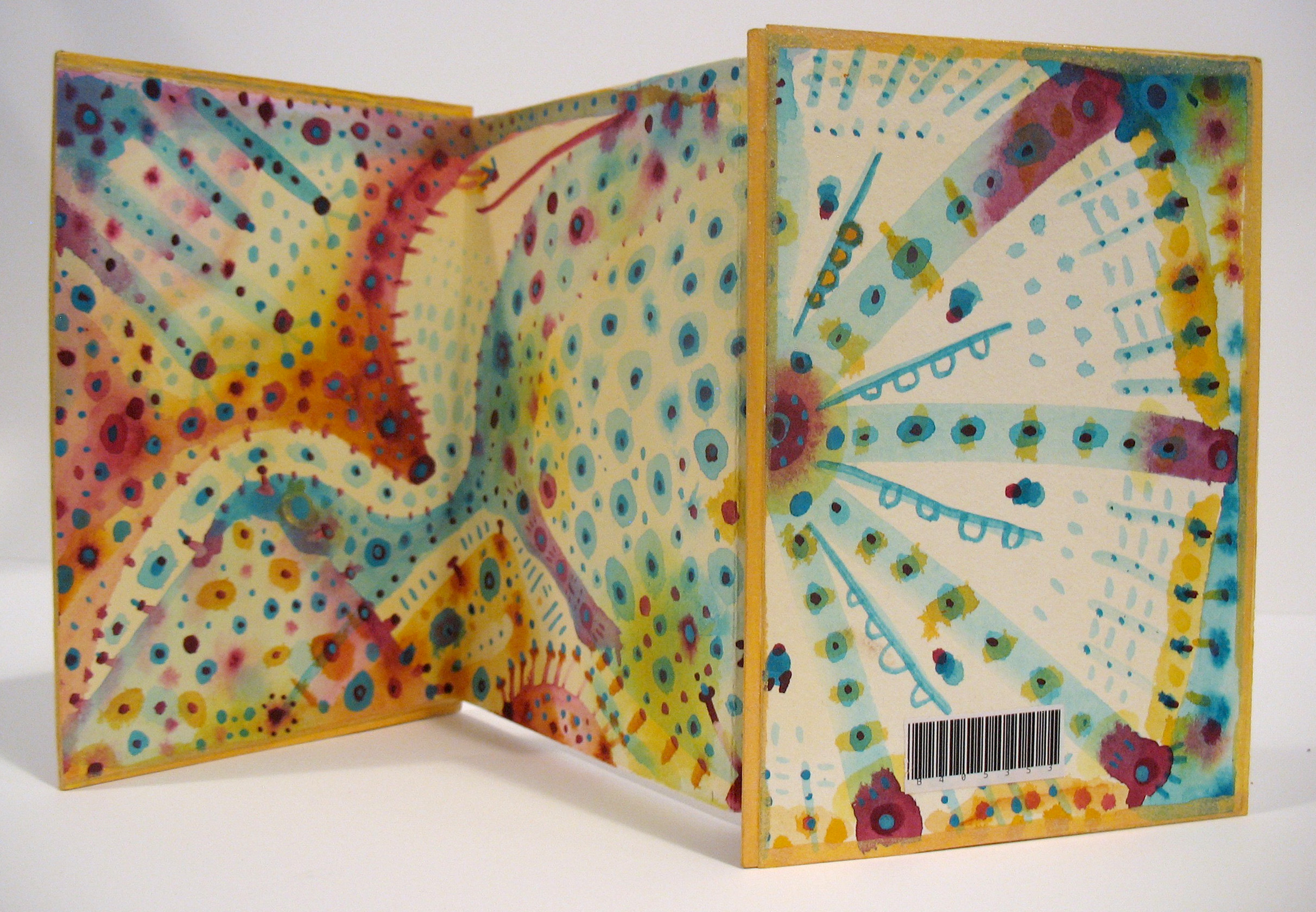
Using different colored paper in the riso printing process can be a fun way to see different color variations without using different colored inks.

Below is the same print in green, orange, red, blue, pink and beige colored papers.
The bright green looks super Evil!

And last but not least, here is a video of the risograph printing the black color on top of yellow, pink, and blue - the final prints!
Jesse says - hello!

Risograph printing for me is always is a lesson in control and letting go. I do all my coloring in Photoshop and try to plan as much as I can - but it always looks a little different once it comes out the printer. I like to allow for happy accidents as well as experiment with more painterly color layering as well as opacity changes.

This particular project was exciting to see on many different colored papers, as I originally designed the graphics for a beige background.

Hope you enjoyed learning more about the process of this piece!


Joy to the World - Riso Print

I work once a week at the Monastery Horse Stable cleaning stalls, feeding horses, and filling hay nets. The barn recently acquired a new horse, named Skip. I like to call him Skippie. He is spunky, gentle and friendly.

Here is a photo of Skippie to the right —>

As the end of the semester and end of the year approached, I wanted to create a quick holiday greeting card.

In the past, I have made very intricate ones as promotional material, but this time I challenged myself to create something “quick” to print with the risograph printer at Moore College of Art and Design, (where I teach Illustration and Graphic Design).

With only 3 days until the college closed for the rest of the year, I began sketching Skippie the horse, inspired by his wavy mane and the naked woods behind him. I couldn’t get his profile out of my head. I needed to keep it simple because of the short turn around time.

Starting with a realistic study, I drew and painted his head over and over, until I simplified it down to naive shapes.

Holbein gouache and ink on paper

Gouache and Ink on paper

“Happy Holidays” didn’t seem like it had much to do with an image of a horse head, so I changed the text to “Joy to the World!”.
Skippie is joyful!

The next day, after a full day of student final critiques, I scanned and placed the Joyful gouache study of Skippie’s profile into the computer. I separated layers for a 3 color riso print, using pink, blue and black. I added other little doodles of animals in the naked woods and negative spaces for stars.

After about 4 hours photoshopping this together, I looked at it and it made absolutely no sense.

Why is there a random horse head is sticking out of forest?

Is it even Joyful?

There was no movement in a disembodied horse head.

Why not draw the entire horse?

But I was so obsessed with the silhouette of Skippie’s head.

I was attached to my sketch.

Time to Kill a Darling!

The next morning with only 3 hours until I had to print the final artwork, on the very last day the college was open, I decided to redraw the horse. Maybe I can make it a Joyful Swimming horse, that way I can build upon the art I already have:

< — No, that looks weird.

I frantically texted my trusty old classmate, Professor Beth Post in Utica, and asked her opinion.

I was time to commit to drawing the entire body of the horse!

I put a timer on for an hour to focus on new sketches.

< — A vertical composition worked better with the full body of the horse.

What if it’s a flying Joyful horse?!

Or a penguin on a flying horse, since penguins can’t fly and also, PENGUINS!

I sketch faster on paper, but to finalize the composition, I quickly took the drawings on paper and re-sketched them in Photoshop with a wacom tablet. —>


I inked the final sketch of the new flying Joyful horse, inspired by Marc Chagall and the painting below from Kiki’s Delivery Service:

Each color layer needs to be in grayscale to create the masters for printing on the risograph machine drums.

As you can see on the right, different opacities of the colors create a lighter shade of the color. Multiple colors can also be layered on top of each other to create new colors, for instance, blue + pink = purple OR yellow + pink = orange.

Below is the final artwork, separated into layers for risograph printing using Black, Pink and Blue.

BLUE - below:

PINK :

BLACK :

3 COLORS TOGETHER :

FINAL PRINT !

Another fun thing about printing with a Risograph printer is using different colors of paper.

Below is the final print on bright white, gray, and beige papers.

Rich Harrington stopped by the print room to check out the machine. In a demo for him, I added another color layer, Yellow, and showed him how to make a master and print colors on top of each other. The Yellow layer was not planned but I like how it turned out as a 4 color print. It adds a warm glow and more Joy!

That is the end of my story of the risograph “Joy to the World!” card, created and printed in what felt like 24 hours.

Although this was a “quick and simple” card, I put a lot of process work into it and made a lot of changes. I thought about the combo of the image and text - if the image really communicated the concept of Joy. I let go of my obsession of the horse head and gained a happy accident using another color layer of yellow. It felt like a whirlwind, but Risograph printing is always worth it!

The cards are printed on card stock and are available to purchase on my web store.

Blob Paintings Series - Acrylic Ink

I recently completed this series of blob paintings on circular canvases. I paint abstract acrylic ink blob washes and layer glazes of white ink to come up with creatures. The process is a little like looking at clouds in the sky and trying to figure out what they may be. Nothing is planned. There are no reference photos. It’s all stream of consciousness and one of a kind. Hope you enjoy!

“Two Eyed Chihuahua” - Acrylic Ink Washes, 8” wide

“Two Eyed Chihuahua” - Acrylic Ink Washes, 8” wide


“Bearded Man, Teddy Pirate &amp; Rabbit with Big Lips” - Acrylic Ink Washes, 5” wide

“Bearded Man, Teddy Pirate & Rabbit with Big Lips” - Acrylic Ink Washes, 5” wide


“Someone Lost Their Chicken?” - Acrylic Ink Washes, 5” wide

“Someone Lost Their Chicken?” - Acrylic Ink Washes, 5” wide


“Five Eyed Chihuahua” - Acrylic Ink Washes, 10” wide

“Five Eyed Chihuahua” - Acrylic Ink Washes, 10” wide


“Five Eyed Chihuahua - Detail” - Acrylic Ink Washes

“Five Eyed Chihuahua - Detail” - Acrylic Ink Washes


“Five Eyed Chihuahua - Detail” - Acrylic Ink Washes

“Five Eyed Chihuahua - Detail” - Acrylic Ink Washes

Red Envelope Show - 2020 - Brooklyn/LA

I am participating in the “Red Envelope Show 2020 - Year of the Rat” curated by Grumpy Bert.

This is a very fun exhibit with a TON of talented illustrators and artists. The artwork on red envelopes is for sale and includes a mystery prize inside!

If you are in LA or NYC, you can check it out in person. Grumpy Bert also puts the artwork online, so stay tuned for more news next year.

HAPPY YEAR OF THE RAT! (which happens to be my year cuz I was born on a RAT year)

LOCATIONS:

Los Angeles: Chinese American Museum 
Opening night: Thursday, January 16th
Show dates:  January 16 - March 15, 2020
Address: 425 N Los Angeles St, Los Angeles, CA 90012

Brooklyn: City Point / Dekalb Market
Opening night: Wednesday, January 29th
Show dates: January 29 - February 17, 2020
Address: 455 Albee Square West, Brooklyn, NY 11201

Title : “What’s Happening in the RAT HOUSE?”  Mixed Media:  Posca pen, brush and ink, colored pencil, paper, yes paste

Title : “What’s Happening in the RAT HOUSE?”
Mixed Media: Posca pen, brush and ink, colored pencil, paper, yes paste

Consider the Gull - Rhode Island Monthly Magazine

I created a full spread illustration for Rhode Island Monthly Magazine - August 2019 Issue, for an article about Sea Gulls at the beach.

Much of my sketches were inspired by drawings from life during family vacations at the beach. Growing up with an avid birding parents, I enjoyed the article’s reference to the identification of different Gulls and how difficult that can be. The chosen thumbnail sketch contains labels that identify the different species of Gulls.

You can read the very entertaining article by Casey Nilsson here.

Below is my process work, including thumbnail illustrations, sketches, inked line work and the final illustration using Photoshop to color.

Big THANKS to AD Doreen Chisnell !


Ring Billed Gull

Ring Billed Gull


Great Black Backed Gull - (HUGIFY and PROPULTION are words that my 10 year old nephew created, as I was sketching with him at the time, and wrote down his dialog.)

Great Black Backed Gull - (HUGIFY and PROPULTION are words that my 10 year old nephew created, as I was sketching with him at the time, and wrote down his dialog.)


A rather hilarious google search image for drawing reference.

A rather hilarious google search image for drawing reference.


THUMBNAIL VERSION # 1

THUMBNAIL VERSION # 1


THUMBNAIL VERSION # 2

THUMBNAIL VERSION # 2


THUMBNAIL VERSION # 3 - This thumbnail was the winner!

THUMBNAIL VERSION # 3 - This thumbnail was the winner!


Final INK - You can see the changes from original thumbnail. My father has a lawn chair like this one, which he uses in his living room, as well as out of doors.

Final INK - You can see the changes from original thumbnail. My father has a lawn chair like this one, which he uses in his living room, as well as out of doors.


Colored ink line work in Photoshop. Playing around with Layer Modes, Textured Brushes, Gradients, Different Line Color, and Layer Opacity.

Colored ink line work in Photoshop. Playing around with Layer Modes, Textured Brushes, Gradients, Different Line Color, and Layer Opacity.

closeupweb02kopeloff.jpg
closeupweb03kopeloff.jpg

Tumble Weed Bread Logo Design

website.jpg

I created this logo for my high school buddy Jessica Larriva who bakes sourdough bread and sells it at the farmer’s market in my hometown of Alamosa, Colorado. Check out her tasty goodies on Instagram.

Alamosa is situated in a large high altitude valley - the San Luis Valley. A long time ago this valley was under water. Once the water dried up, the sand blew east and accumulated into the TALLEST Sand Dunes in North America!

I camped there over night this summer. It was wild!

The vegetation is pretty different from where I live now on the east coast.
Chico bushes, chamisa bushes, sage bushes….and TUMBLE WEEDS!

Here are a few photos of the valley and the sand dunes :

01f1a05053c6242fcfa23075e5b963c1_XL.jpg
Screen Shot 2019-09-16 at 7.19.53 PM.png
Screen Shot 2019-09-16 at 7.20.27 PM.png
Screen Shot 2019-09-16 at 7.20.06 PM.png
Our camp site.

Our camp site.

Sunflowers are every where. Even growing in sand?!

Sunflowers are every where. Even growing in sand?!

Post camp-hike status.

Post camp-hike status.

At my mom’s house.

At my mom’s house.

The view from my mom’s house.

The view from my mom’s house.

2019 - Year of the Pig

I created a few red envelopes for the Red Envelope Show at the Flushing Town Hall organized by Grumpy Bert.

Tons and tons of fantastic artists created original artwork on red envelopes for this year’s Year of the Pig.

The red envelopes are available to purchase online at Grumpy Bert or in person if you happen to be in Queens, NY.

All envelopes come with a surprise inside!!!

Red Envelope Show
January 5 - 27, 2019

Flushing Town Hall
137-35 Northern Blvd, Flushing, NY

kopeloff_redenvelope01web.jpg
kopeloff_redenvelope02web.jpg


Web Icons for Second State Press Shop

At the beginning of this year I participated in the FOB Holder Program at Second State Press, where I worked and got access to the print shop.  It was an awesome experience where I met many talented printmakers and learned to silkscreen.

These icons are based on objects and tools (and even one small letterpress!) at Second State Press.  

If you are in Philly, Second State is worth checking out - they offer classes, free community workshops, and exhibition opportunities. 

Below are some SSP creations up on my Etsy Shop and just a few of the awesome people I met: 

Moira Connelly
Ashley Limés Castellana
Scott Porcelli
Stephany McKean
Joanna Nowak
 

icons_sspweb.jpg
angellinoweb.jpg
brainlinoweb.jpg
linorobotweb.jpg
bluecardweb01.jpg
greencardweb.jpg
bookmarkvariationweb.jpg
minicomic.jpg

Graphic Design - Typography Class at Arcadia University - GIFS

Check out these fantastic animated GIFS made by my Graphic Design Typography students at Arcadia University!  Most of them even created their own hand lettering for this project. Such talent. 

Lunavictoria_GIF.gif

Happy Holidays Promo!

Printed and mailing out new Holiday Cards!  See you all in 2018!

Happy Holiday Card
Happy Holiday Card Interior
Process Card

T-Shirt Design for North American Bushcraft School

I designed a t-shirt graphic for the North American Bushcraft School  which offers classes in wilderness survival and primitive technology.

"The More You Know, The Less You Need" is the concept of the design.  The more we educate ourselves about mother nature, the less we rely on modern objects that bog us down.  By learning to use plants as medicine, food, and tools, we are no longer afraid of the wilderness but work with it for all our needs. 

A few years ago I visited Sera and Jason's property in Pennsylvania where they host classes and camps.  I got to hang out with their goats, practice archery, and braid rope using grass.  If you are ever in Pennsylvania, it's worth the trip!

Birthday Card

Printing some new cards!  This one is a Birthday Card and is part of a series of 5" x 7" cards. Below is the inked drawing in black and white.  You can see the color change that I created in Photoshop:

At the Drive In

DESCRIPTION:
"At the Drive In" is an image inspired from living in the woods of Westchester county many years ago.  There are so many garden creatures: moles, deer, bats, birds, snakes, raccoons, owls, even neighbors dogs and cats.  There are big rock walls, and at night perhaps all the nocturnal creatures get together for an entertaining film. 

PROCESS:
First, I begin with a sketch.  Then, using a nib and ink, I redraw (or ink) the sketch on quality paper using black ink.  In order to add color, I scan the ink drawing into the computer and use Photoshop to color the line work, add fill colors, highlights and shadows. 
Enjoy!

Colorful Ink Wash Leggings

Check out these colorful leggings I designed at Society 6.

Good for your favorite yoga poses, laying in leaves, and flopping around.

You could be a walking ink wash this dreary winter season!


Sketchbook Project 2017 - Ink wash book

Interior

Interior

Front Cover

Front Cover

Back Cover

Back Cover

I created this small accordion ink wash book with hard covers on watercolor paper for the Sketchbook Project Library in Williamsburg Brooklyn.  You can go check it out in person at library collection, as well as viewing tons of other sketchbooks from around the world. 

Linoleum Relief Printmaking - Robot

Recently finished a flying robot linoleum print.  Carving and printing was super therapeutic.

Three more in series to come!